The Problem With Looking Professional
There is a common mistake I see in indie games from first-time Indian developers. They want their game to look professional, so they buy an asset pack from the Unity or Unreal store, drop it into their project, and call it done. The result looks competent at first glance — the models are well-made, the textures are high-resolution, the lighting is technically correct. But it also looks exactly like every other game that bought the same asset pack.
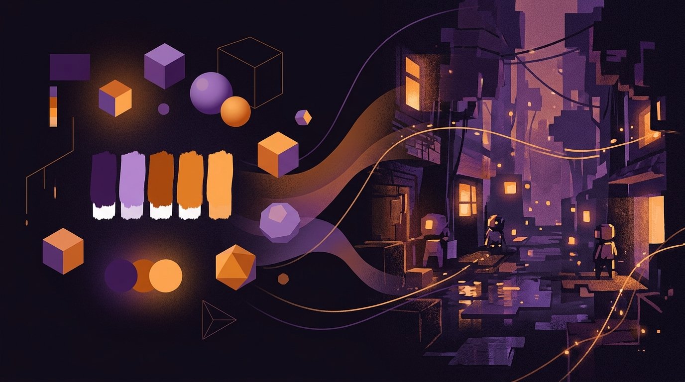
Professional-looking is not the same as having a visual identity. A game with a distinctive art direction will always be more memorable than a game that looks generically polished, and the good news is that distinctive art direction does not require a large budget. It requires decisions.
Generic polish versus deliberate art direction — the second is almost always more effective at attracting attention.
Approaches That Actually Work
Over three years of reviewing indie games, I have noticed recurring approaches that produce strong visual results on minimal budgets. These are not theoretical — they are drawn from games I have played and documented.
Limit the palette
The simplest thing a solo developer can do is restrict their colour palette. Pick four to six colours and use them throughout the entire game. This creates visual consistency without requiring any particular drawing skill. I played a puzzle game from a developer in Hyderabad that used only three colours — dark blue, pale yellow, and white — and the screenshots alone were enough to make me want to try it. The constraint made every visual element feel intentional.
The practical advantage is significant. When you limit your palette, you spend less time agonising over individual colour choices and more time on level design and gameplay. It also makes marketing materials easier to produce, because anything you create will automatically look cohesive.
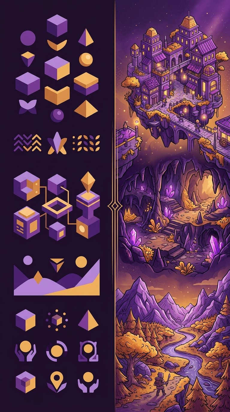
Embrace simple geometry
Some of the most visually effective indie games I have covered use nothing more than basic geometric shapes — circles, rectangles, triangles — arranged with care. A developer in Pune built an entire narrative game using coloured rectangles to represent characters. No faces, no detailed sprites. Just a red rectangle for one character and a blue rectangle for another, moving through abstract environments. It sounds minimal, and it is, but the emotional impact was surprisingly strong because the visual language was so clear and consistent.
This approach works because the human brain is excellent at assigning meaning to simple shapes when the context is right. A triangle moving through a dark environment reads as vulnerable. A large square blocking a doorway reads as an obstacle. You do not need detailed art to communicate these ideas — you need clarity of intent.
Use photography and collage
A few Indian indie developers have experimented with using real photographs and paper collage elements in their games. One project I reviewed used photographs of Mumbai streets as backgrounds, with hand-drawn character sprites overlaid on top. The juxtaposition was visually striking and cost almost nothing to produce — the developer took the photos on a phone and drew the characters in a free illustration app.
This approach is underexplored. It immediately distinguishes a game from the crowd of pixel-art and vector-graphics indies, and it connects the game to a real place in a way that painted environments cannot. If your game is set in a specific Indian city, using photographs of that city as a visual foundation is both practical and thematically resonant.
| Approach | Cost | Skill Required | Best Suited For |
|---|---|---|---|
| Limited palette | Zero | Low | Puzzle, platformer, strategy |
| Simple geometry | Zero | Low | Narrative, abstract, experimental |
| Photography/collage | Near zero | Medium | Narrative, walking simulator |
| Hand-drawn (stylised) | Low (time) | High | All genres |
| Pixel art (low resolution) | Zero | Medium | Retro, platformer, RPG |
Common Mistakes
I have also seen approaches that consistently fail, and it is worth discussing them because they waste more time and money than any other aspect of indie development.
Mixing asset packs. Combining art from different asset packs almost always looks worse than committing to a single simple style. The lighting models don't match, the proportions are different, and the overall effect is visually chaotic. If you are going to use purchased assets, pick one pack and stay within it.
Chasing realism. Realistic 3D art is the most expensive and time-consuming style to produce well. A solo developer attempting realistic environments will almost always produce something that looks worse than a deliberate stylised approach. This is not a skill issue — it is a resource issue. Even well-funded studios struggle with realistic art. Do not fight this battle.
Ignoring UI. Many indie developers spend months on character art and environment design and then slap a default engine UI on top of everything. The UI is the visual element players see most often. If it clashes with the game's art direction, the entire experience feels unfinished. Even a simple custom font and consistent button styling make a significant difference.
Three indie games that achieved strong visual identity through constraint rather than budget — limited palette, geometric characters, and photographic collage.
The Pixel Art Question
Pixel art is the default choice for indie developers who cannot afford artists, and there is a reason for that. It is accessible, it has a built-in audience, and the tools are free. But it is also crowded. Every storefront is saturated with pixel-art games, which means that choosing pixel art without a clear reason makes it harder to stand out, not easier.
If you choose pixel art, do it because it serves your game's design and mood, not because it is the path of least resistance. And if you do choose it, commit to a low resolution. The most common mistake I see is developers working at 320x180 or higher, which requires far more drawing skill than the 160x90 or lower resolutions that defined the classic pixel art look. Lower resolution means fewer pixels to draw, which means less time per frame and a more cohesive visual style.
Practical Workflow
For a solo developer starting from zero, here is a workflow I have seen produce good results.
First, before you draw a single pixel or model a single polygon, write down three adjectives that describe how you want your game to feel visually. "Dark, geometric, lonely." "Warm, organic, cluttered." Whatever fits your game. These three words become your filter for every visual decision you make afterward.
Second, create a reference board. Collect 10 to 15 images — from other games, from art, from photography, from architecture — that evoke the feeling you described. This is not about copying. It is about having a visual anchor to return to when you are deep in development and losing perspective.
Third, make your first piece of art and use it as a template. Whether it is a character sprite, a background, or a UI element, this first piece establishes the rules for everything that follows. What colours do you use? How thick are the outlines? How detailed are the textures? Lock these decisions early and stick to them.
Fourth, do not revise your art direction mid-project unless something is fundamentally broken. The temptation to redo your art is constant and destructive. Every hour spent reworking existing art is an hour not spent improving gameplay. Ship what you have and learn for the next project.
Final Thought
The games I remember are never the ones with the most expensive art. They are the ones where the visual style felt like a deliberate choice — where every screen looked like it belonged to the same world, and that world had a point of view. That kind of art direction is free. It just requires the discipline to make decisions and stick with them.
If you are an Indian indie developer working with no budget and no artist, your constraint is an advantage. Use it. The games that emerge from limitation are almost always more interesting than the ones that had every resource available.
Patricia Ramirez
Editor and founder of SJHYPS. Based in Mumbai, Maharashtra. I cover independent and creative games from Indian developers. This is a personal project separate from my work at Digital Wave.
References
- Video game art — Wikipedia
- Pixel art — Wikipedia
- Stuart, K. "The art of indie game development," The Guardian, 2022 (referenced for general art direction discussion)
Further Reading
- Why Indian Indie Games Deserve More Attention — SJHYPS
- A Practical Guide to Indian Game Jams — SJHYPS
- What SJHYPS Covers — our editorial scope and process
- Contact SJHYPS — submit your game for review
- Independent video game development — Wikipedia